Objective
1st Source Bank is one of the most trusted regional banks in the state of Indiana.
As we neared final designs in early 2022 for their website redesign, their executives worried about two things:
How intuitive would our content strategist’s streamlined navigation recommendation be for their online banking customers?
How do their customers feel about the new design direction overall?
I was brought in near the end of the design process to immediately dive in, understand any usability and information architecture issues, and make refinements in order to move forward to development.
Light on time? See the recap deck!
-

Understand
Learn about client goals, scope, and any prior research that preceded me.
Create a research plan to uncover insights & build stakeholder alignment.
-

Experiment
Execute moderated usability testing to uncover attitudinal & behavioral insights.
Run tree testing as a control to understand if proposed information architecture makes sense to users.
-

Advise
Report findings to internal and external stakeholders.
Work collaboratively with content strategist on information architecture recommendations.
Original State
Regarding navigation, my predecessor’s usability testing of the site’s original state revealed:
Dense and counterintuitive hierarchy and labeling delayed the bank’s personal & business banking users from accomplishing key tasks
Double-nested tab navigation disoriented business users specifically - they didn’t know if they were in personal or business
Revised State
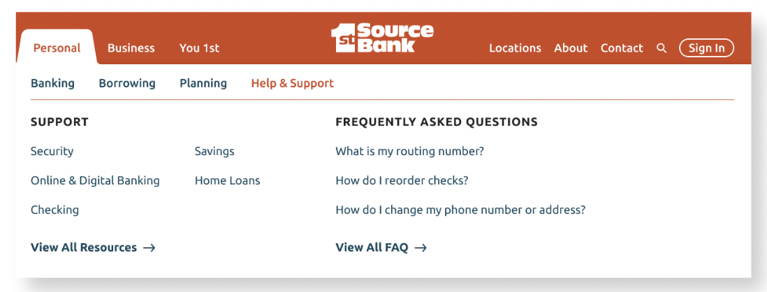
New look. New feel. Simplified navigation. But would do customers think?
Testing… Testing
Usability Testing
We recruited 10 users total; 5 retail (personal) banking customers and 5 business banking customers.
Find the specifics of my testing plan, task lists, and results here.
Key Results:
People loved the brand’s new visual language.
Pathways to contact pages and phone numbers were efficient & direct.
Customers enjoyed the conciseness of the new navigation structure.
Retail customers experienced indecision between FAQ’s and resources in “Help & Support.”
Business customers experienced indecision between “Managing Your Business” and “Growing Your Business.”
Tree Testing
Evaluating the nav structure’s hierarchy and labeling at scale without visual stimuli was necessary to be truly data-informed.
Find the results of the tree test here.
Key Results:
Based on path results, customers seemed to associate “Managing Your Business” with task-based administrative support rather than knowledge management, cannibalizing “Help & Support.”
Based on path results, customers seemed to associate “Growing Your Business” with more actionable business objectives.
New & Improved
Interested in the new site and nav structure?
See for yourself!


